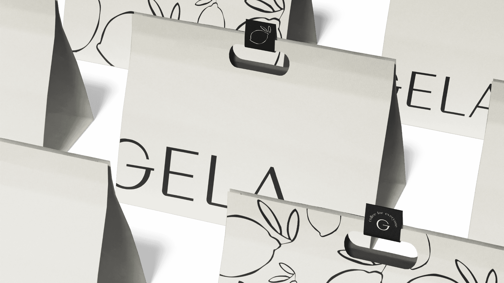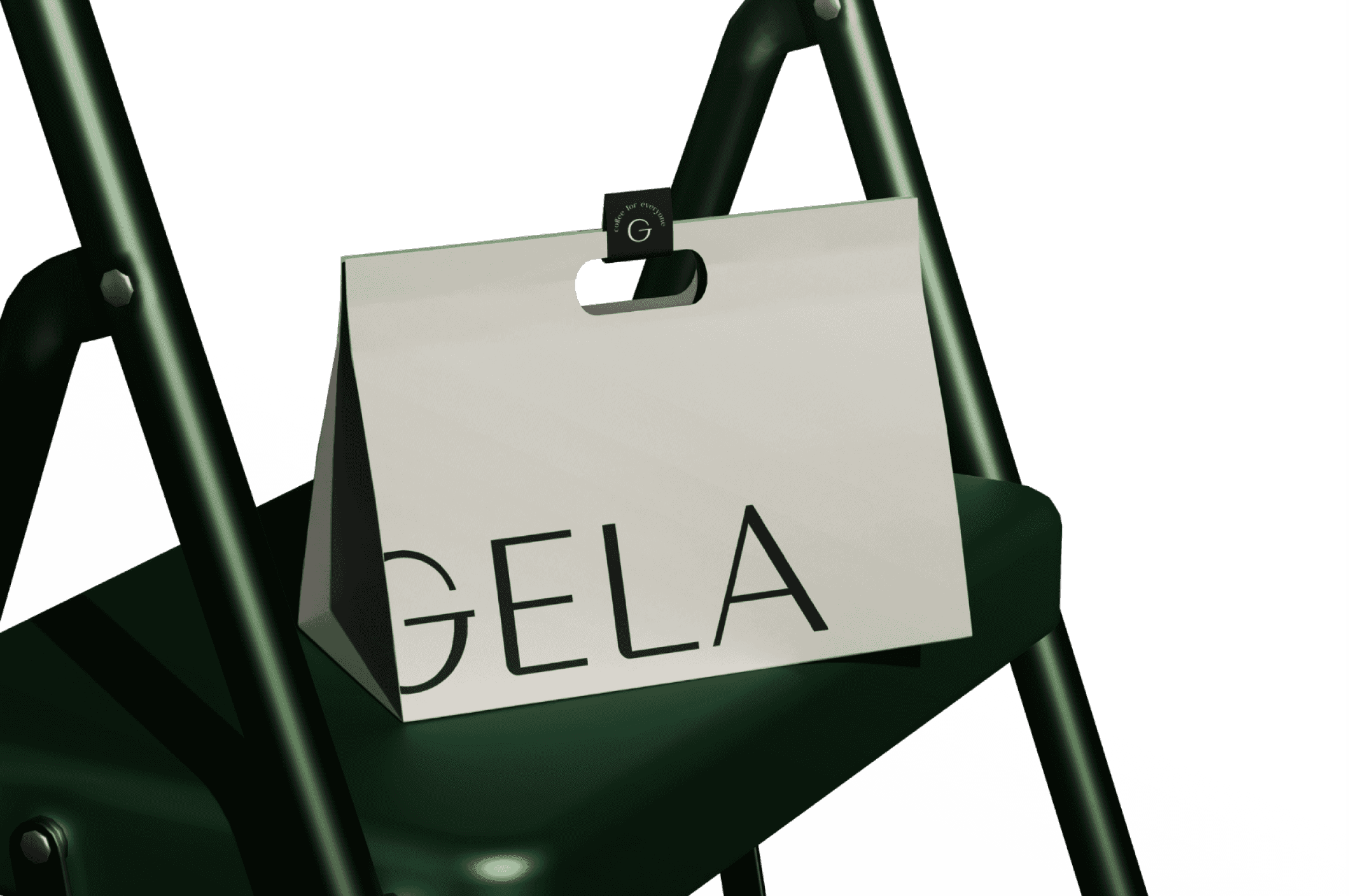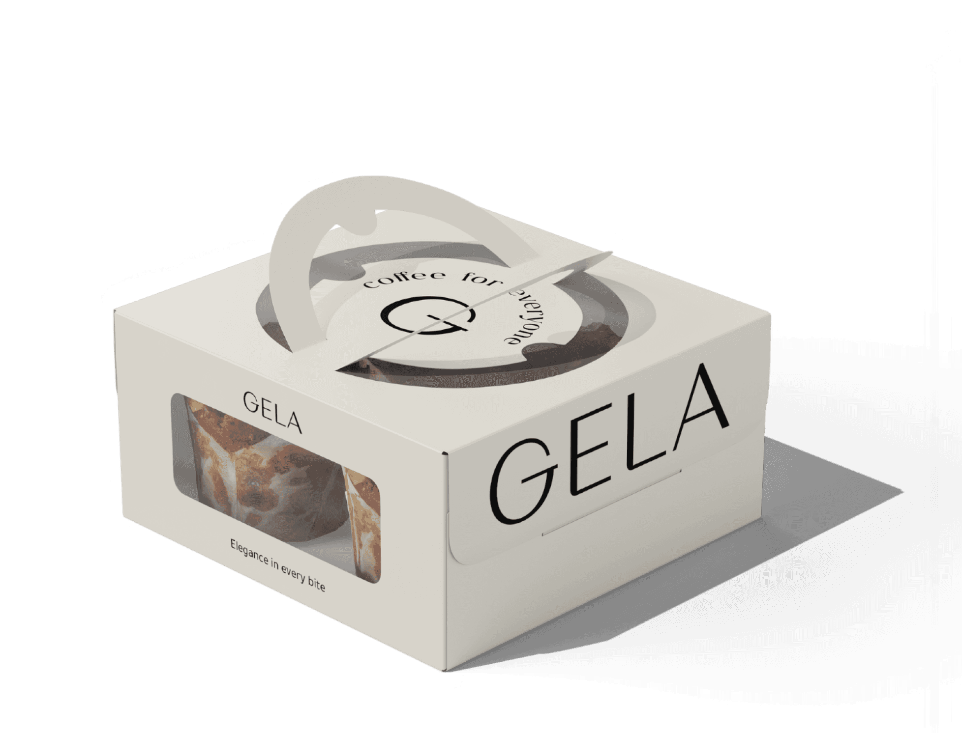
mockups
mascot
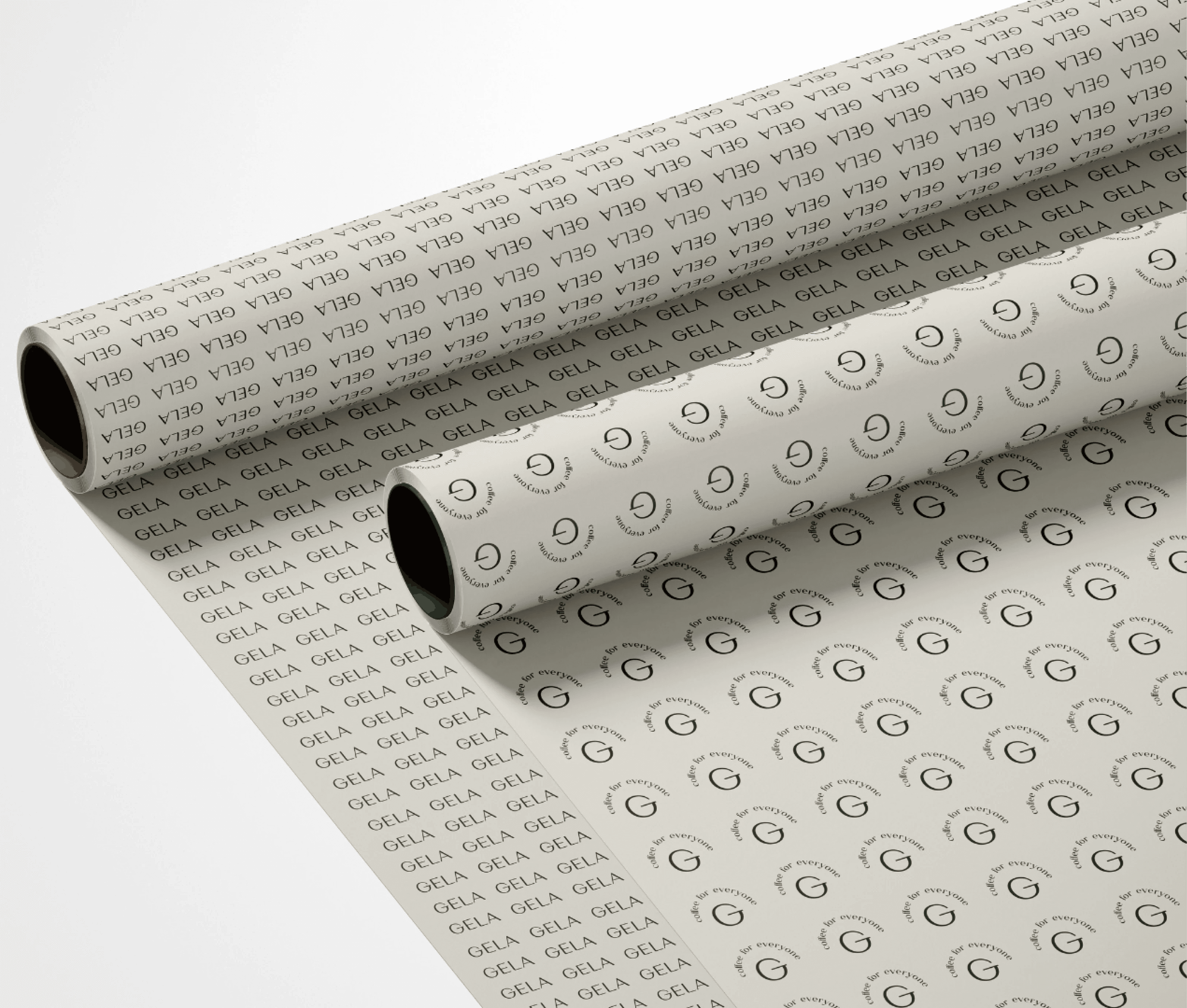
pattern design
Gela Cafe
“I want to create a social experience and continue what my dad envisioned . A place that feels equal and welcoming for everyone.”
Client
services
logo
Azzan Arif Company
Owner of Gela
about
Gela is more than a coffee brand. It’s a lifestyle inspired by family roots and the timeless charm of Sicily. The name carries dual meanings: a nod to the Sicilian town and a deeper sense of uniqueness. Something bold and independent
Every detail reflects minimal luxury and a passion for innovation. Just like its name, embraces fluidity. Our dishes are not fixed but evolve with time, offering contemporary flavors and experiences that are fresh, new, and inspiring.
We create spaces where exceptional coffee and culinary artistry meet meaningful human connections. It’s where craftsmanship, community, and comfort come together, making every visit a unique moment of discovery.
Gela’s logo was designed to reflect the brand’s minimal luxury philosophy through simplicity, balance, and timeless elegance. The clean letterforms create a refined and contemporary identity, while maintaining a warm and approachable presence that aligns with the café experience.
Beyond the primary wordmark, the identity expands into flexible logo applications and supporting lockups such as “coffee for everyone”, reinforcing Gela’s inclusive and community-driven spirit. The system was designed to remain adaptable across digital, packaging, and environmental touchpoints while maintaining a consistent visual language.
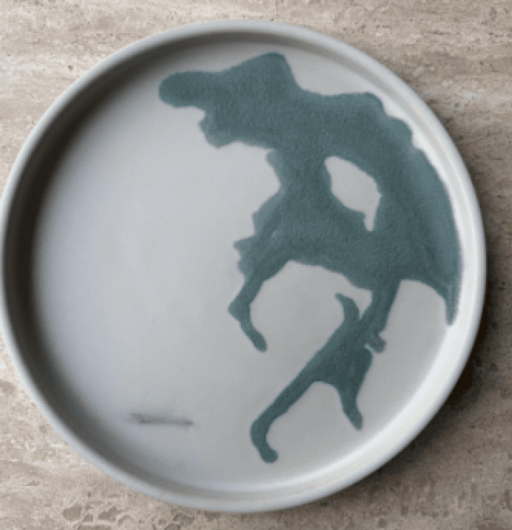
The mascot finds its roots in the lemons of Sicily, Italy. A symbol of vibrance, freshness, and artisanal craft. Just like the rolling citrus groves that define the Sicilian landscape, the lemon embodies a sense of authenticity, warmth, and timeless beauty.
It reflects Gela’s deep connection to Italian culture, where simplicity and elegance meet in every detail. The organic curves of the lemon also inspire the brand’s visual language, shaping patterns, paths, and design elements that echo this Mediterranean heritage.


Brand identity
social media
packaging
A logo designed to feel inclusive
How Sicilian lemons shaped Gela’s visual launguage
The lemon was chosen as Gela’s mascot as a tribute to Sicily’s rich citrus culture and Mediterranean warmth. More than just a visual element, it became a symbol of freshness, craftsmanship, and the welcoming spirit behind the brand.
Its organic shape and soft curves also influenced the broader visual language of Gela, inspiring patterns, graphic compositions, and flowing brand elements seen across the identity system. Simple yet expressive, the mascot helps create a memorable and human-centered brand experience.
The lemon as a symbol of Gela’s mediterranean identity

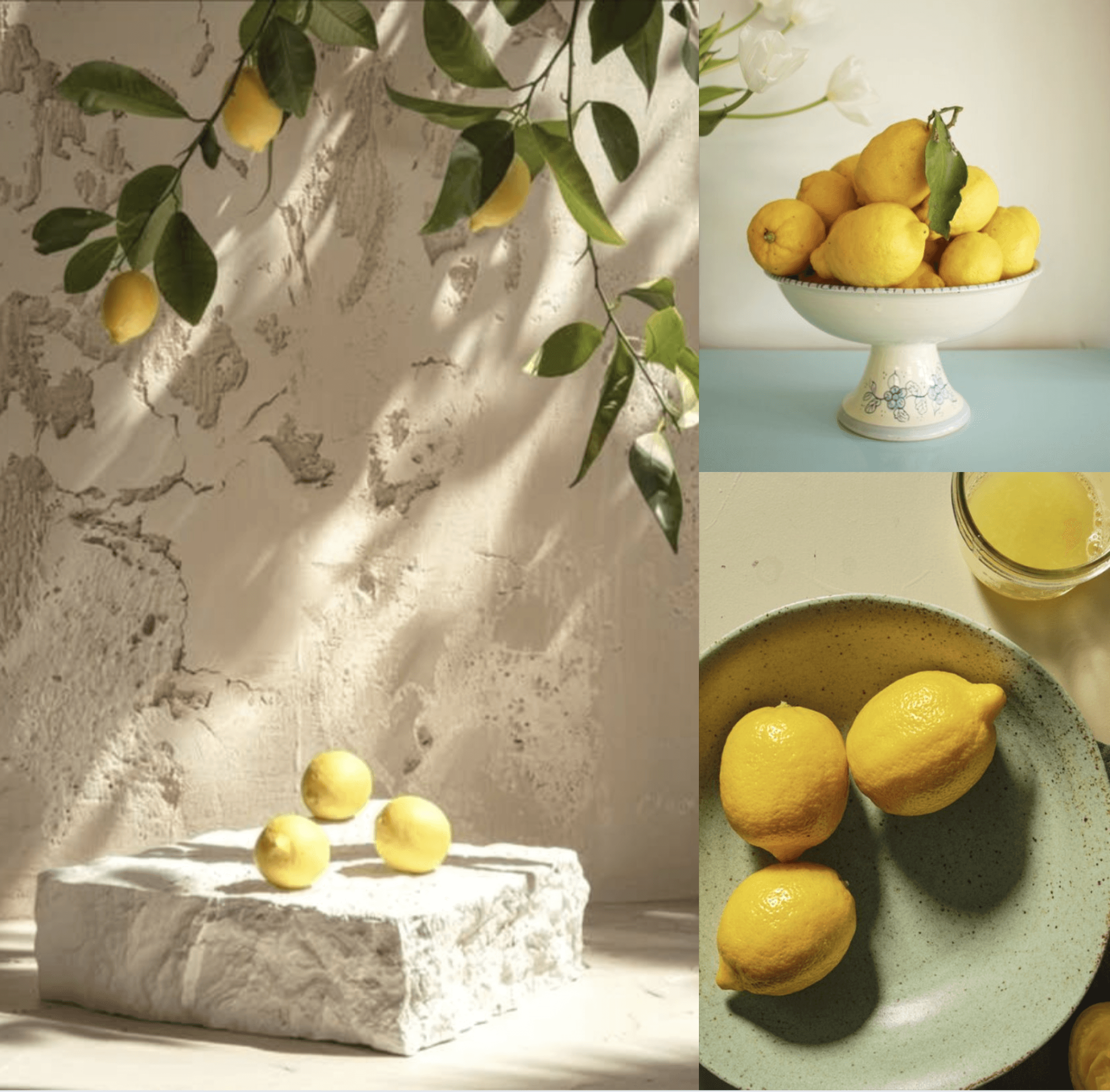
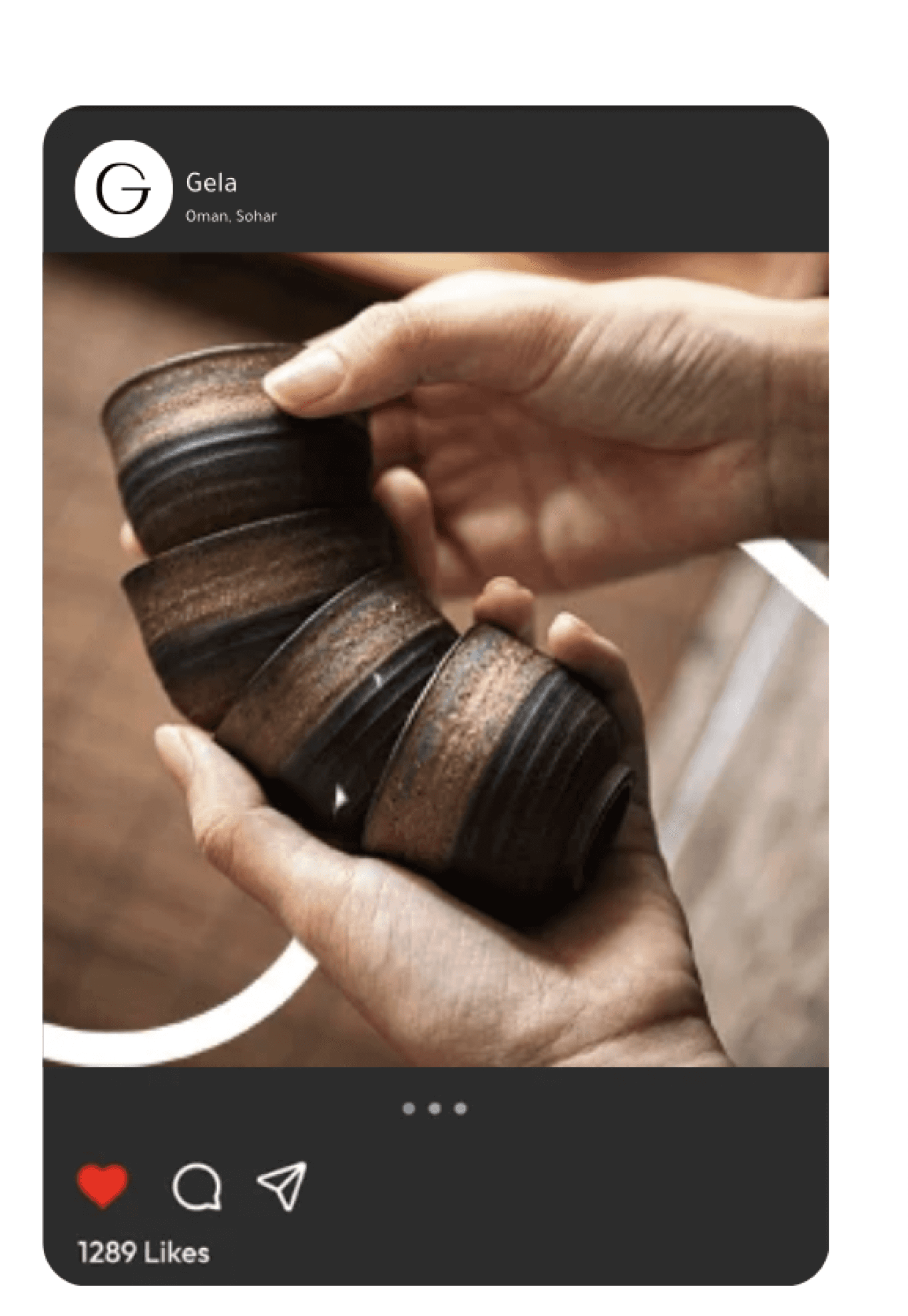
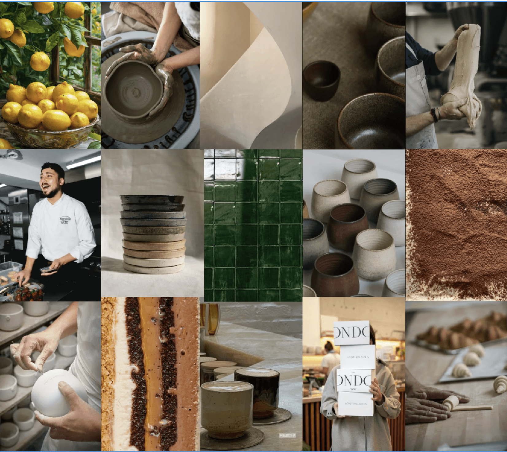
Before designing Gela’s identity, we explored a wide range of visual references rooted in Mediterranean culture, craftsmanship, and natural materiality. Elements such as Sicilian textures, handmade ceramics, organic curves, sand waves, and earthy green tones became the foundation of the brand’s visual direction.
These inspirations shaped not only the aesthetic of the identity, but also the emotional atmosphere behind it warm, artisanal, and deeply connected to human experience. From flowing wave-like forms to ceramic surfaces and natural textures, every reference contributed to building the world of Gela as a contemporary yet timeless café experience.
The Visual Inspirations Behind Gela’s Identity
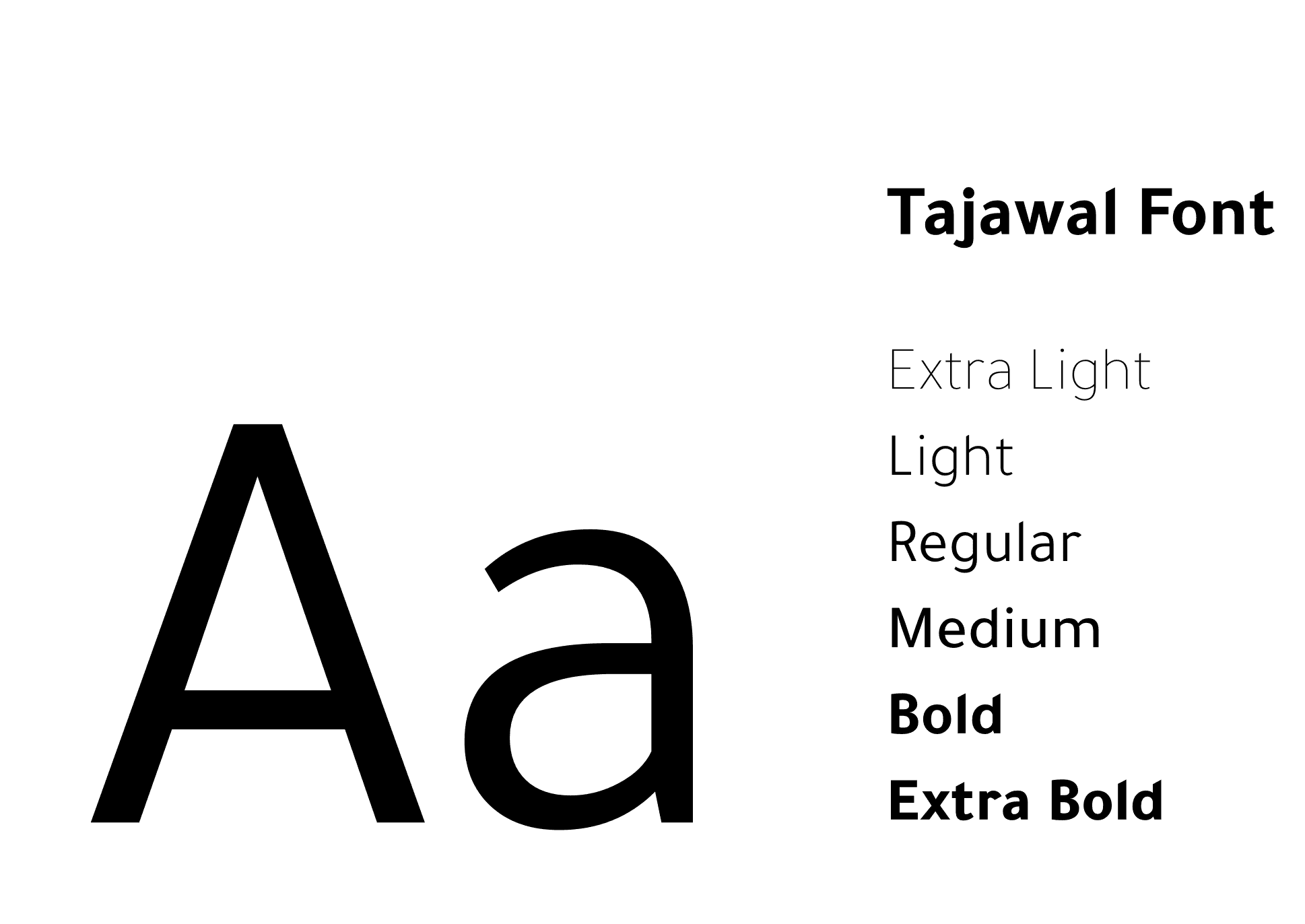
Typography plays a central role in shaping Gela’s visual tone. Tajawal was selected for its ability to balance clarity with elegance, creating a modern typographic system that feels calm, human, and timeless across every brand touchpoint.
A typeface designed to feel minimal
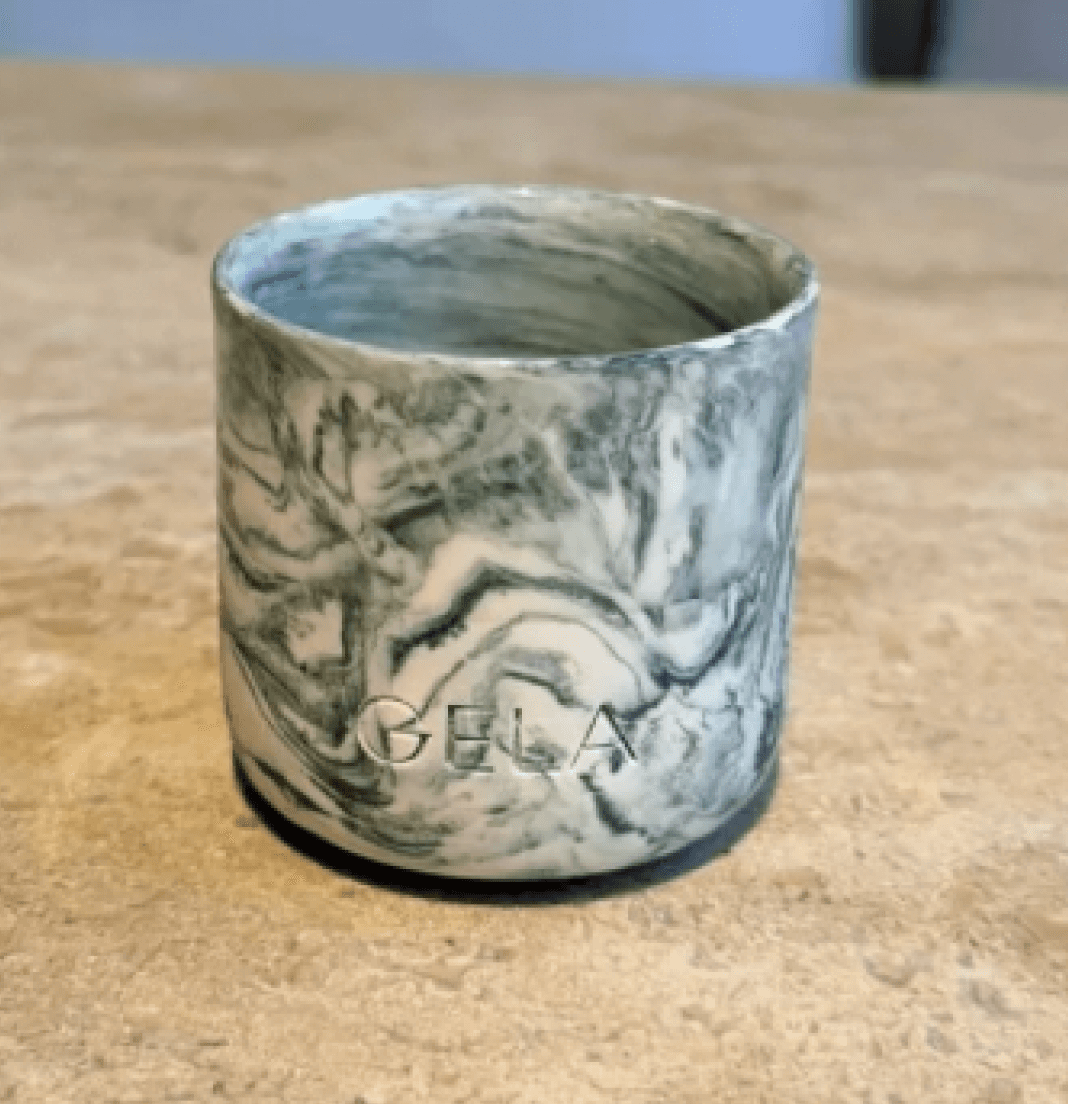
Alabaster became the foundation of Gela’s visual identity because it reflects the brand’s balance between minimal luxury, warmth, and timeless simplicity. Inspired by natural ceramics, Mediterranean interiors, and soft organic textures, the color creates a calm and refined atmosphere that feels both contemporary and welcoming.
Unlike stark white tones, Alabaster carries subtle warmth, allowing the full identity from photography to materials and graphic elements to feel more human, artisanal, and emotionally connected. It also acts as a neutral canvas that enhances Gela’s earthy greens, citrus-inspired yellows, and rich brown accents throughout the brand system.
Why Alabaster became the core of Gela’s visual identity
As we observe the design elements within Gela, there’s a rich visual language inspired by textures found throughout the space and tableware. From subtle speckled dots to organic waves, soft circles, and timeless marble patterns, these details reflect Gela’s minimal yet artistic identity.
We aim to integrate these textures seamlessly into the branding and graphic system, creating a cohesive visual story that echoes the café’s environment and elevates the overall brand experience.
Translating physical textures into brand elements
#FFFFFF
Light Shade Color
White
Brunswick Green
#144734
Secondary Accent Color
Raw umber
#966132
Secondary Accent Color
School bus yellow
#FFDA27
Secondary Accent Color
#000000
Dark Shade Color
Black
Dark green
#0D2819
Accent Color
Alabaster
#F0ECE1
Primary Brand Color


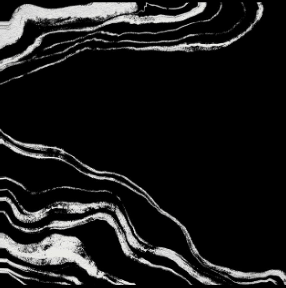


The path we envision draws its inspiration from the lemon mascot its organic curves, soft edges, and natural flow. These subtle yet expressive lines will define the visual language of the brand, echoing not only the shape of the lemon but also the elegant curves of GELA’s ceramic cups and tableware.
This approach creates a design path that feels artisanal, fluid, and deeply connected to the café’s identity.
Mascot pattern
Logo lockups
Pattern lockups


Pattern lockups
Pattern lockups

Pattern lockups
Pattern lockups
Pattern lockups
Pattern lockups
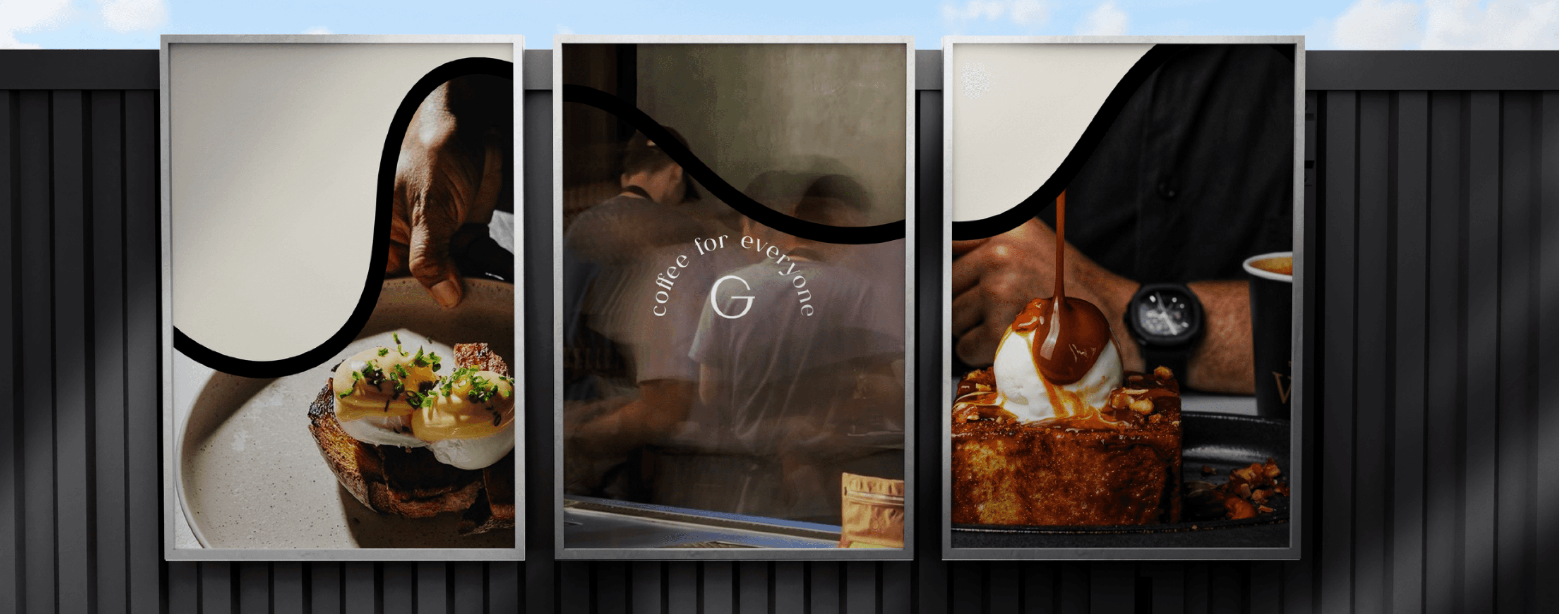
Food photography here isn’t just about capturing what’s on the plate; it’s about highlighting emotion, warmth, and artistry. Each image is designed to reflect the textures, colors, and soul of the space.
Zoomed in shots in warm lighting emphasize the richness of the ingredients and the handmade nature of every bite.
The color tones are carefully selected to blend naturally with the overall aesthetic: earthy, refined, and timeless. Even food content feels like part of a larger visual story. These photos aren’t just about appetite; they’re about atmosphere.
Food photography
Food photography here isn’t just about capturing what’s on the plate; it’s about highlighting emotion, warmth, and artistry. Each image is designed to reflect the textures, colors, and soul of the space.
Zoomed in shots in warm lighting emphasize the richness of the ingredients and the handmade nature of every bite.
The color tones are carefully selected to blend naturally with the overall aesthetic: earthy, refined, and timeless. Even food content feels like part of a larger visual story. These photos aren’t just about appetite; they’re about atmosphere.
Motion identity
Packaging mockups
Gela’s Instagram isn’t about showcasing food alone; it’s about telling a story. A story of textures, crafted spaces, and the soul behind every detail. We focus on interiors, natural light, artisan touches, clay, candles, and the joy in people’s smiles.
It’s an artistic space where food appears as part of the narrative close-ups of textures, layered details, and moments of craft. While food content exists, it lives in highlights; the feed remains an editorial curation of GELA’s environment, evoking the brand’s minimal luxury identity.
Mood board
contact


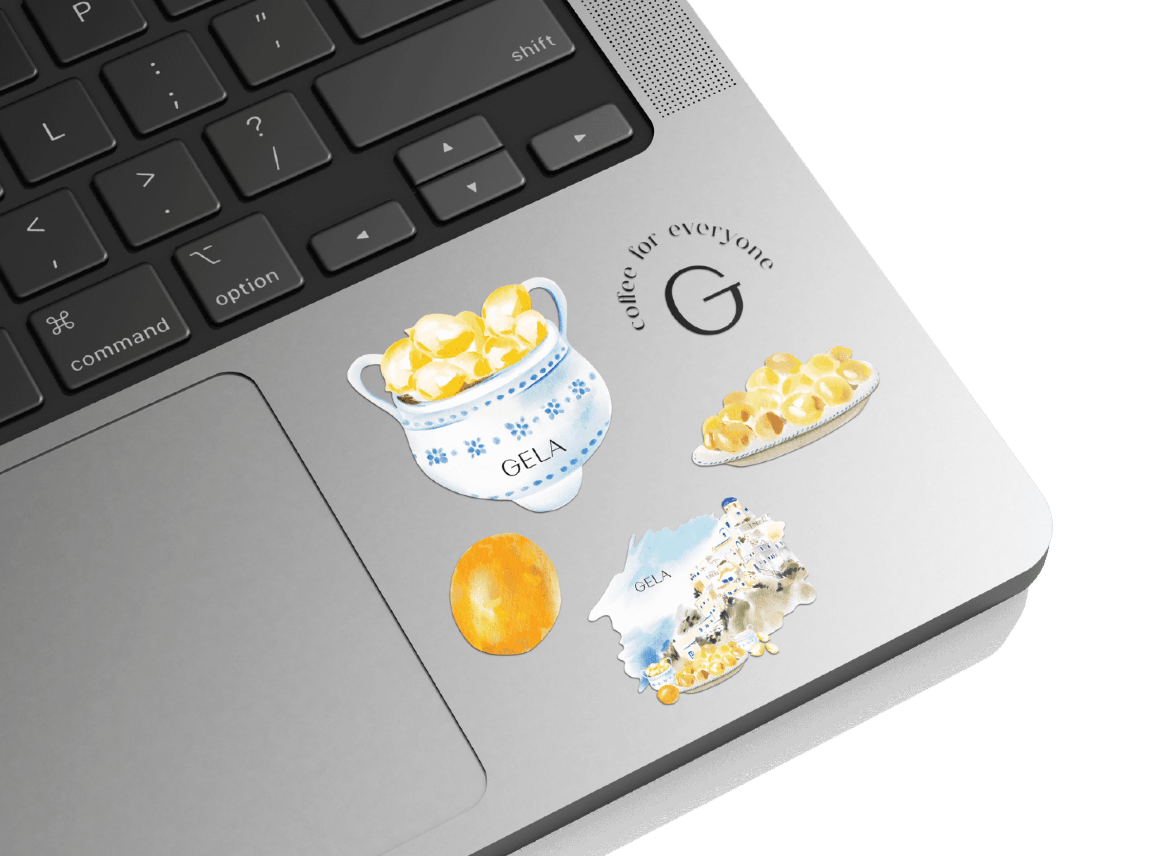
Gela stickers to remember us!